PICK UP ITEMピックアップ商品
-
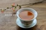
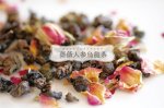 薔薇人蔘烏龍茶ティーバッグ10P or 20P
冷えやむくみでお悩みの方へ
3,293円(税244円)
-
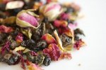 【5個まで送料無料!】薔薇人蔘烏龍茶(ばらにんじんうーろんちゃ)ティーバッグお試し1P
メール便発送
392円(税29円)
-
 白牡丹 20g
2,160円(税160円)
-
 青森のりんごを使った5種のフレーバーティー
173円(税13円)
-
 青森のりんごを使った5種のフレーバーティー・アソート
1,188円(税88円)
-

 FLOW - 3types -
842円(税62円)
-
 FLOW ティーキャディースプーン&インフューザー ギフトセット
1,280円(税95円)
-
 FLOW 3種ギフトボックス
2,980円(税221円)
-
 ドリップコーヒー ライトギフトセット
702円(税52円)
-
 鳳凰単叢(ほうおうたんそう)夜来香(やらいこう) 20g
夜に咲く花の名を持つ、気品ある静かな香りの単叢烏龍
2,916円(税216円)
-
 鳳凰単叢(ほうおうたんそう)蜜蘭香(みつらんこう)20g
澄んだ余韻の美しさが際立つ一杯
1,990円(税147円)
-
 香雪花(こうせつか)ジャスミンティー 20g / Xiang Xue Hua
2,160円(税160円)

最近チェックした商品
最近チェックした商品はまだありません。
RANKKING
-
1
FLOW ティーキャディースプーン&インフューザー ギフトセット
1,280円(税95円)
-
2
FLOW 3種ギフトボックス
2,980円(税221円)
-
3
薔薇人蔘烏龍茶ティーバッグ10P or 20P
冷えやむくみでお悩みの方へ
3,293円(税244円)
-
4
人蔘烏龍茶(にんじんうーろんちゃ)
20g・40g・80g
1,866円(税138円)
-
5
焼き林檎ほうじ茶 ティーバッグ10個入り
国産ほうじ茶に焼きりんごフレーバー
962円(税71円)
-
6
キャラメルカスタードチャイ ティーバッグ10個入
キャラメルの香りの本格チャイ。電子レンジで簡単につくれるティーバッグ仕様。
1,097円(税81円)
-
7
サムシング・ブルー
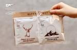
ブライダル・プチギフト
538円(税40円)
-
8
人蔘烏龍茶スターターセット 10日分+専用マグ
初めての方はこちらから!
6,978円(税517円)
-
9
りんごの和紅茶 (青森県産りんご使用)ティーバッグ10個入
青森県産りんごの果肉をつかったアップル・フレーバーティー
962円(税71円)
-
10
はちみつほうじ茶 ティーバッグ10個入
とろりと甘いはちみつが香るほうじ茶です。
962円(税71円)
-
11
青りんご煎茶 ティーバッグ 10個入
962円(税71円)
-
12
白牡丹 20g
2,160円(税160円)